1. This is an Inhalation Hazard symbol that you might see on a sign. It's easy to understand which is important for those who might not speak the native language.
2. This is an Eye Wash Station symbol. Just as with the Inhalation Hazard symbol, it's easy to understand.
Monday, October 6, 2008
2 Symbols


Sunday, October 5, 2008
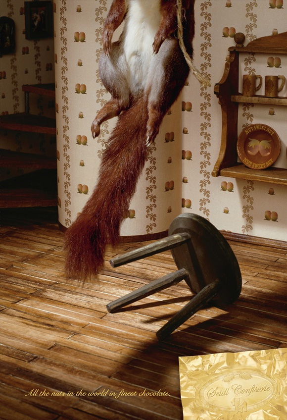
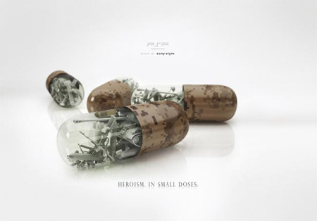
3 Print Ads

2. The second ad is pretty straightforward. The placement and style of typeface used are very appropriate.
3. Even though the typeface is very small in this ad, it gets the point across. "Heroism in small doses."
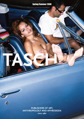
Magazine Cover
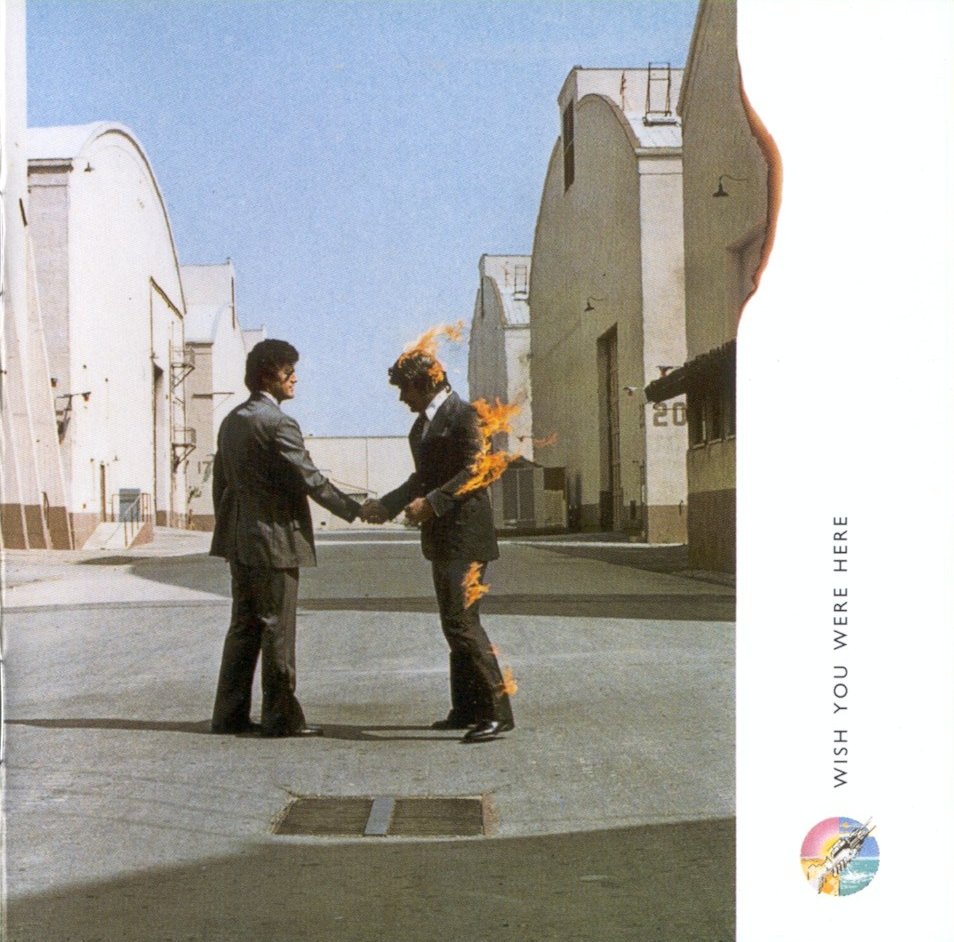
CD sleeves
I like the way that the album logo is repeated on the front and the back of the case. It connects the covers.
I wasn't really sure which album front to use, so I just posted both. I've never heard this album, but the use of human silhouettes in place of bomber planes portrays a strong message.


2 Movies
This title sequence for "Panic Room" has a very interesting use of typography. The way that it seems three dimensional and part of the cityscape is very clever.I'm sure several people are going to use this movie, but I can't help it. The way the type is used as objects is very interesting.
Saturday, October 4, 2008
3 Commercials
I think that the animation in this commercial is very eye catching and shows how "hip" this Walkman is. Plus, it's Japanese.
Book Jacket
Freakonomics' has a very interesting jacket, despite the fact that it's not something I would be interested in reading. So I guess it's doing it's job. The repeated color scheme is what attracts me, and the fact that what is happening on the jacket itself is very surreal.

3 Logos

2. The Department of Health and Human Services' logo is one that I have seen many times, but never paid much attention to to. Now that I'm taking a careful look at it I see how complex it really is. I suppose that the human profiles could be seen in a couple ways, but I see them as being people of varying ages, and the fact that they are made to help form the body and wings of the eagle is very interesting to me. I bet this took several tries and lots of planning.
3. Amphibian Ark or AArk is a group of several partnerships who's goal is to "ensure the global survival of amphibians – focusing on those that cannot be safeguarded in nature." This logo is perfect. It really shows the security and safety that these people are trying to provide these animals with. The design itself is great as well; everything is connected, from the edge of the ark and frog to the foot coming over the edge of the boat.


Wednesday, October 1, 2008


Subscribe to:
Comments (Atom)
