
2. The second ad is pretty straightforward. The placement and style of typeface used are very appropriate.
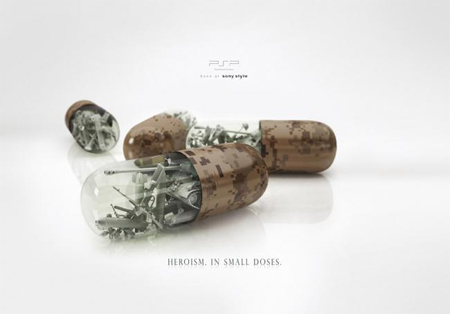
3. Even though the typeface is very small in this ad, it gets the point across. "Heroism in small doses."
Sunday, October 5, 2008
3 Print Ads
Posted by Britt at 10/05/2008 10:58:00 PM
Subscribe to:
Post Comments (Atom)

0 comments:
Post a Comment