


Saturday, November 8, 2008
Monday, October 6, 2008
2 Symbols
1. This is an Inhalation Hazard symbol that you might see on a sign. It's easy to understand which is important for those who might not speak the native language.
2. This is an Eye Wash Station symbol. Just as with the Inhalation Hazard symbol, it's easy to understand.


Sunday, October 5, 2008
3 Print Ads

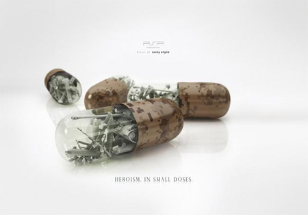
2. The second ad is pretty straightforward. The placement and style of typeface used are very appropriate.
3. Even though the typeface is very small in this ad, it gets the point across. "Heroism in small doses."

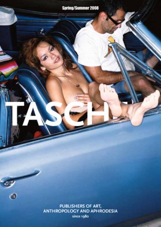
Magazine Cover
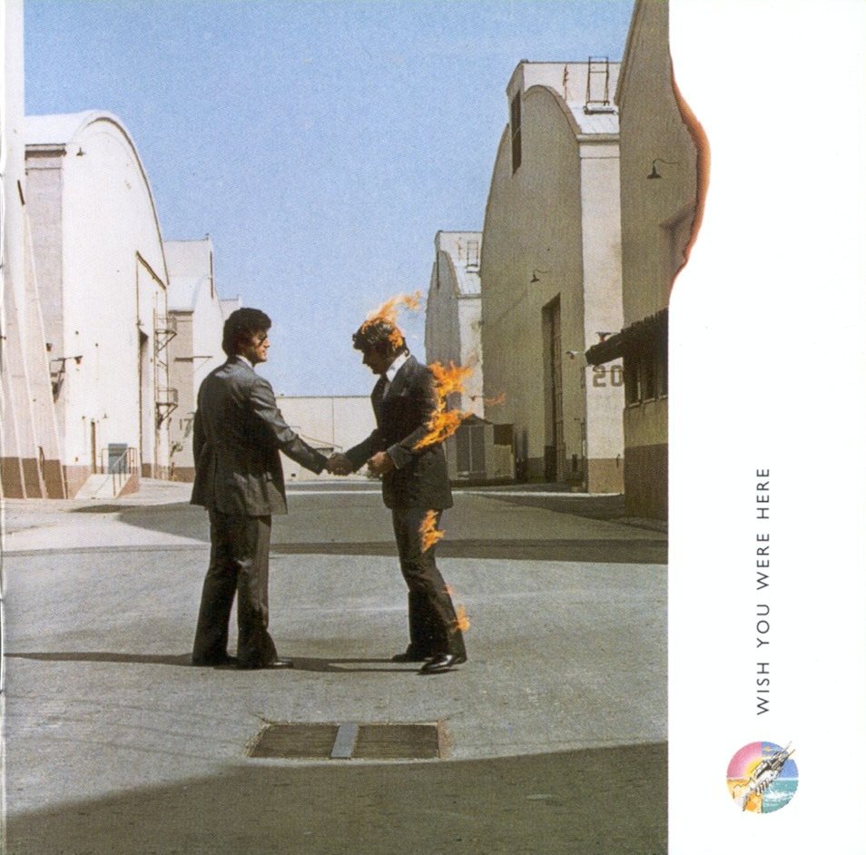
CD sleeves
I like the way that the album logo is repeated on the front and the back of the case. It connects the covers.
I wasn't really sure which album front to use, so I just posted both. I've never heard this album, but the use of human silhouettes in place of bomber planes portrays a strong message.


2 Movies
This title sequence for "Panic Room" has a very interesting use of typography. The way that it seems three dimensional and part of the cityscape is very clever.I'm sure several people are going to use this movie, but I can't help it. The way the type is used as objects is very interesting.
Subscribe to:
Posts (Atom)
